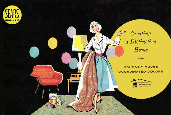
Introducing the Harmony House colors of 1958. After weeks of delay we are finally back to reveal the color you have been waiting for. These major and accent colors can bring each room of your home into the new century through the stroke of a paint brush.
Warm dawn gray with a stroke of frosty pink. Accents of sunshine yellow and aquamarine.
Ooo...swanky.
This is the Ming Blue family, welcome home.
Shades of Ming blue accented with yellow and black.
Oh..sorry, I was busy jumping on my bed.
Frosty pink and Cherry Red with Aquamarine, black and spice brown. Can you see that floral wall paper?
"Gay color scheme for the room in which a women spend so much of her time?"
"Practical decorating"
Ladies, this is when it all went wrong.
Sunshine to relax?
Not so sure on this one.
An old chair painted sage green...hmm...sounds familiar.
Then they completely lost me.
An occasional chair in Federal Gold?
No..that will never come back in style again...in my house at least.
If you need me I will be in my pink room digging around in my aquamarine jewelry box all weekend long.


15 comments:
Fun find! I love looking back to the catalogs and reference books of the 40's and 50s! They are hilarious.
Thanks for sharing.
I might have to join you in your pink room!! That is my favorite, and that green sage chair is lovely! I would take bits from all, except the gold!! Happy weekend to you! xo Heather
Wasn't this the same era that featured "The Twilight Zone" on tv?
That luscious harvest gold chair...Hmmm..I wonder if they used it in their filming of the series??!!
Thanks for taking us on a sentimental journey, Renee! I wouldn't have missed it!
Have fun spending time in your pretty pink playroom this weekend, my funny friend!
Blessings and so many thanks for your visits and kind comments on my blog!
Carolynn xo
Love that frosty pink. I've really enjoyed your catalog postings. Have fun playing in your special room.
Awe I love the Ming Blues and the Frosty pinks yeah!!
"A Perfect Room For the Young Miss"
Love it! Erica
I'm on board with the pink and gray - it's the new mauve and dusty blue, you know. 8+)
Ha, I will never miss the avocado appliances, burnt orange carpeting, brown couch and gold lamps! That's what it was like for me growing up!
What fun! I'm am not a pink person. It might be the Pepto Bismal pink on the walls of my room as a girl that turned me off for life. I do love those aquas though, but they DO NOT go with anything else I have.
Ah, memories!
One of the houses we're looking at has rooms painted in a pencil gold/orange color and I just hate it! I have a good imagination but I prefer thinking about the houses that *wouldn't* have to be painted.
Well, I'm with you. I could pretty much live in that pink bedroom with red and teal accents. Woohoooo. That's my kind of room. Those are the colors I did my sewing room and studio in. I feel happy around those colors. Love this post, I was born in 1958. I have to start digging through all of my old magazines and see what I can find, might be fun!
Hugs,
Julie
This was so my Granny's house! And I thought it was sooo pretty!! I can't imagine!!
This is so fun Renee. Funny how much turquoise as accent colors they used and how popular some of those colors are today! Hope you're having a nice weekend!
The gold chair, yeah, that was in the house I grew up in! Our "den" was rust, gold and avocado green. The colors of the day! Oh, and my bedroom, it could have belonged to Marsha Brady, the walls were hot pink, the carpets was red "shag" and I had a purple velvet bedspread, and had big pillows with those long, legged, hippy looking kids with those really big eyes, Groovy, I tell ya!
Linda
Renee, I let my husband talk me into a day away from the computer, and darn if I didn't miss the opportunity to purchase one of your amazingly cute Nursery Series. I'm consoled by this fun post. I love the color names! PS Your pillow sent to Vivian is such a kind gesture. It fills my heart with joy to know what your gift will always mean to her. E
Post a Comment